Drama is usually pretty messy, but Samsung slammed Apple pretty beautifully in this ad.
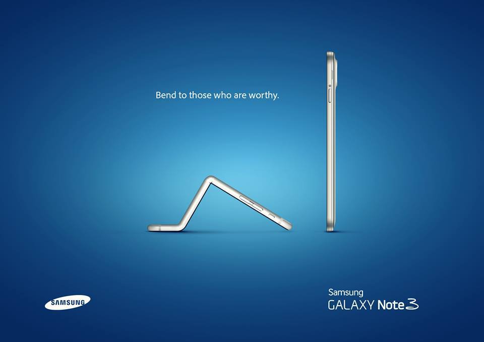
Believe it or not, when it comes to content creation, beauty is not in the eye of the beholder. It’s a science. Yep, there are things that make content appealing to the eye. We’re gonna go over the exact four reasons why this content is appealing. Let’s talk C.R.A.P.
1. Contrast
Samsung plays with something called “contrast” in this image, which is highlighting stark differences in the content, message, colors, etc. It provides focus, and it creates categories in our minds. In this image, there’s a stark contrast in the phones.
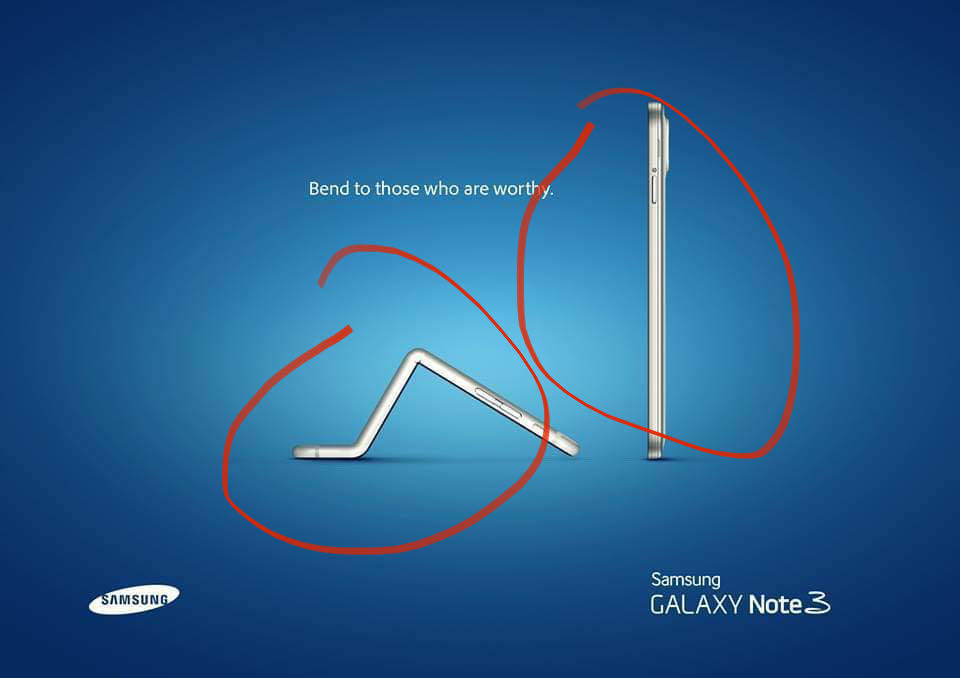
Right? At this time, Apple had some issues with their phones being made of material that bent easily while in people’s pockets.
What are the categories they’re establishing? Unworthy phones and worthy phones.
Here we’re playing with the difference in Apple phones and Samsung Phones. Our eyes love to see differences – they love contrast. Diversity is fun. It’s appealing. Maybe because we like order.
Check out the different fonts they intentionally use! How the white pops out of the blue background is another way they’re using contrast to appeal to our eyes.
2. Repetition
Repetition creates unity in an image. See any repetition in the photo?
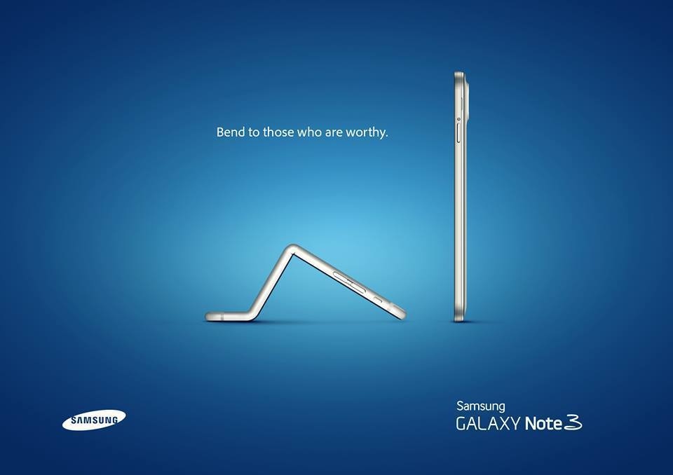
The white text – it’s consistent. It means that all of the text is connected somehow.
The phones – they’re both the same color, which I believe helps highlight the main difference (contrast): Apple phones bend.
If you’re any fan of Samsung or have seen a handful of their ads, you’d notice that they always similar shades of blue throughout their brand. Repetition is crucial when it comes to branding. For example, Coca Cola dominates the color red in the soda industry. They claimed the color as their own because of their consistency (repetition) in using it.
Alignment
Center alignment is basic. If you want content to boldly stand out, break the status quo. Not only that, but in this image, it’s the strength of the lines that the content sits on that connects the content. Check this out.
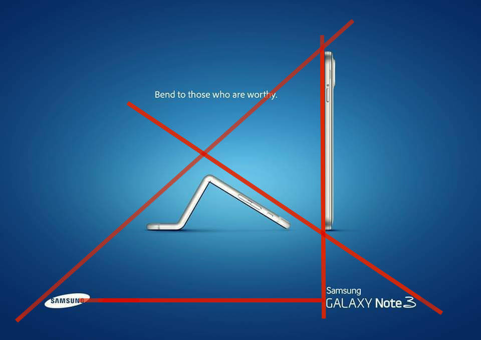
See how everything is visually connected?
The Samsung phone is aligned with its model (Samsung Galaxy Note 3), the model is aligned with the brand, and the brand connects back to the worthy phone. It’s all visually connected to make a triangle, which in my opinion is a powerful shape because of the hierarchy it established (an example of the repetition of theme in this image).
Notice that the Apple phone is bowing to the Samsung phone, but if you follow the head of the phone, it’s actually aligned with the model. They did a great job.
Proximity
The strength of relationships is shown by proximity. Here’s what’s close to each other in the photo.
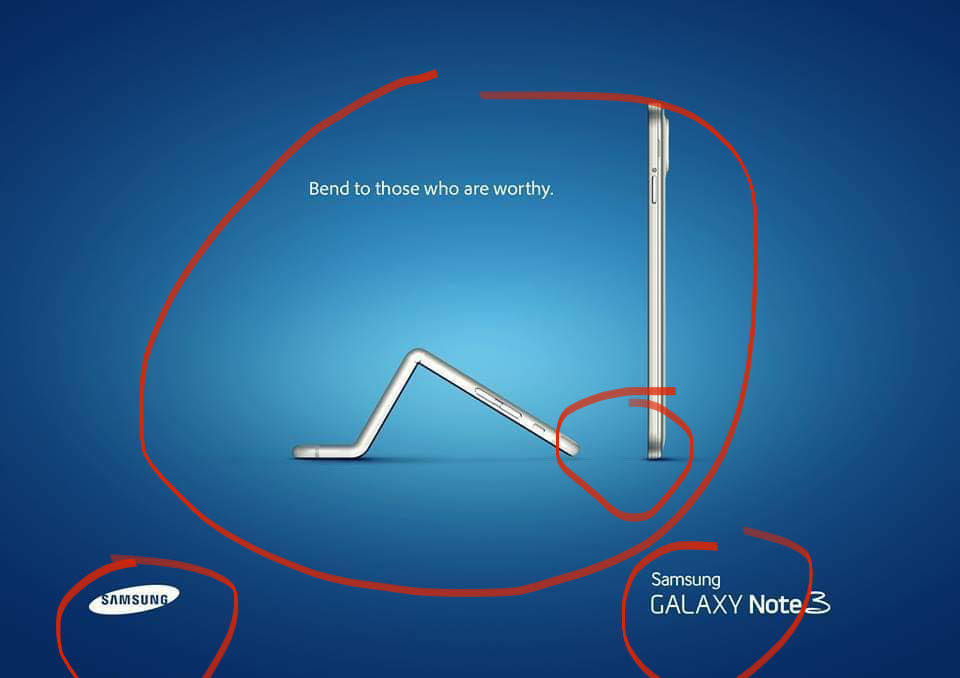
There’s the main message of the content in the middle (the phones and the caption), and we’ve got the model and the brand outside of that main message.
The model’s closer to the phone than the brand, which is probably because the model is more important than the brand. Everybody knows who Samsung is, but what’s this new phone?
Personal opinion, but how close the head of the iPhone is to the feet of the Samsung is an A1 proximity diss.
One More Thing: Color
Colors evoke emotions, and for the most part, there’s a universal opinion of how colors make us feel. If you thought this image was sleek, here’s another reason why.
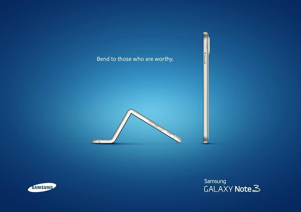
Blue is a cool color because it’s quiet, it’s calm, and it’s peaceful. Samsung here is saying, “It’s settled. There’s no conflict. It’s just the indisputable truth. It’s established. Apple phones just aren’t worthy.”
White here represents purity, which is fitting since the image is about worthiness.
In a nutshell, that’s the C.R.A.P. concept that makes content good content!

